
Canadian Twenty Five Cent Obverse Designs
|
This page shows the major die designs since Canadian 25 cent coins were introduced in 1870. It does NOT cover "die blunders", where dies were re-punched
with different years (and the previous number is visible below the current number), or where cracks appeared in the dies causing unwanted lines
to appear in the coin. It also does not cover date doubling or special coins created for the collector market. All of the coin designs displayed here were
manufactured for general circulation as legal tender. NOTE: Click on any photo to load a much larger version of the same photo |
||||||||||||||||||||||||||||||||||||||||||||||||||||||||
|
||||||||||||||||||||||||||||||||||||||||||||||||||||||||
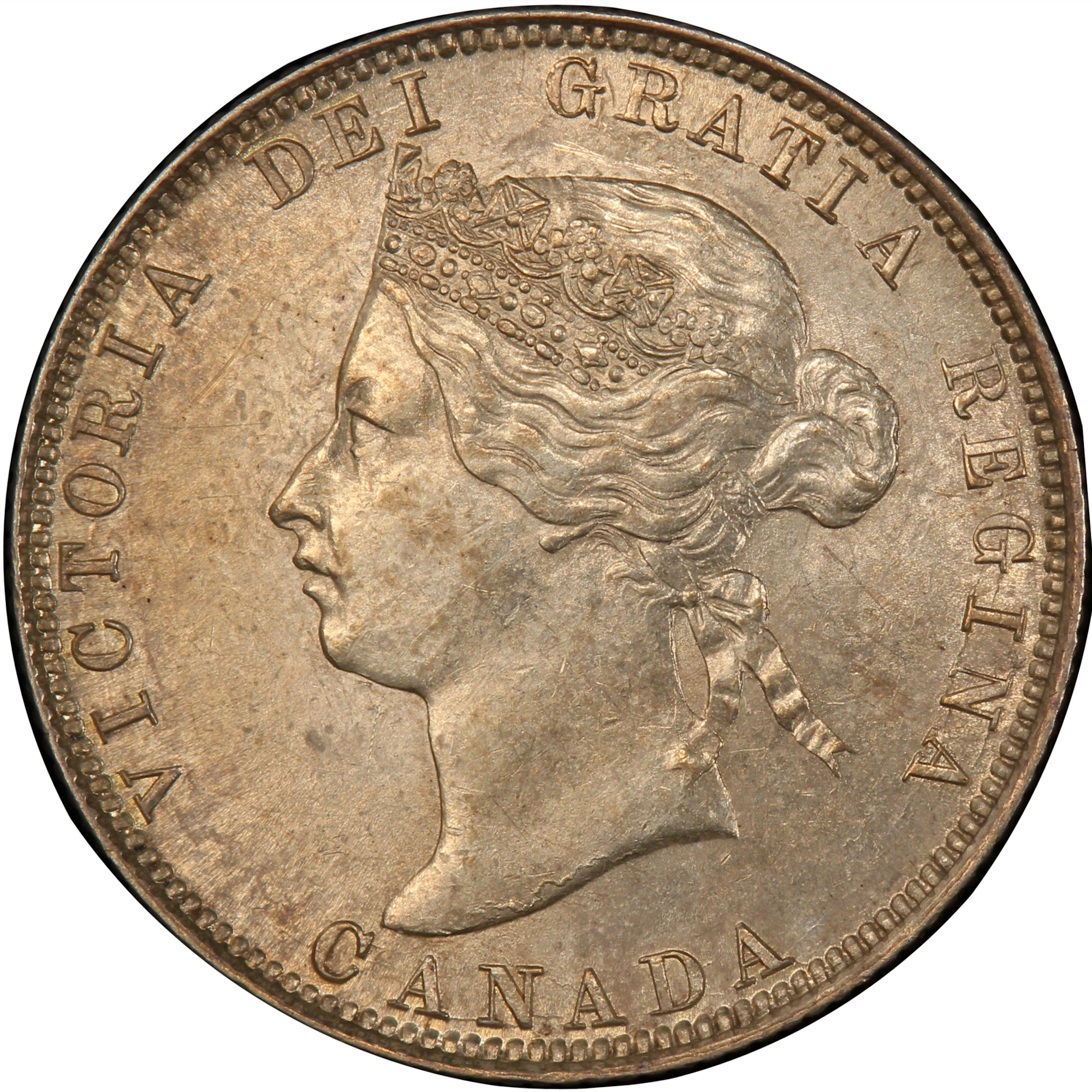
1870-1901 There are five different obverse varieties found on 25 cent coins between 1870 and 1901. Views of three key areas of the obverse for each variety can be found below the overall view section. NOTE: There is a GREAT obverse identification tool now available to collectors. Coins And Canada has created a page that lets you select two different obverse designs and compare them side by side using a slider. Click the following link to load the Victorian 1 cent page: Victorian 25 Cent Obverse Comparison Tool |
|
1870, 1871, 1871H, 1872H(OQ1) 
|
Queen Victoria  Victorian Obverse known as "OQ1". The acronym is explained as follows: O = Obverse Q = Quarter 1 = Variant Type 1 The portrait in left profile of Victoria is surrounded with the inscriptions "CANADA" and "VICTORIA DEI GRATIA REGINA" (Victoria, Queen by the grace of God) Lettering: VICTORIA DEI GRATIA REGINA. CANADA Engraver: Leonard Charles Wyon Note: The basic layout and content is the same for all varieties of Victorian obverse, however there are subtle but noticeable differences between them. These differences are generally found in the following areas: - The hairline between the brow and the crown - The upper and lower eyelids - The curl of the upper lip, and the detail in the corner of the mouth - The degree of doubling of the chin - The shape and centering of the V in the hair ribbons |
Victorian Obverse known as "OQ2" |
|
Victorian Obverse known as "OQ3" |
|
Victorian Obverse known as "OQ4" |
|
Victorian Obverse known as "OQ5" |
|


OQ-1  |
OQ-2  |
OQ-3  |
OQ-4  |
OQ-5  |
|
OQ-1  |
OQ-2  |
OQ-3  |
OQ-4  |
OQ-5  |
|
OQ-1  |
OQ-2  |
OQ-3  |
OQ-4  |
OQ-5  |
|
King Edward VII  After the death of Queen Victoria in January of 1901, a new effigy was designed featuring King Edward VII. The portrait in right profile of Edward VII wearing the Imperial State Crown is surrounded with the inscription "EDWARDVS VII DEI GRATIA REX IMPERATOR" (Edward VII, by the grace of God King and Emperor) Lettering: EDWARDVS VII DEI GRATIA REX IMPERATOR Engraver: George William de Saulles The designer's signature (DES) can be found below the truncation King's effigy, towards the front of the chest. |
|
King George V  After the death of Edward VII, the coronation of George V in 1910 and the addition of India to the British Empire, a new obverse featuring King George V wearing the Imperal State Crown, surrounded by "GEORGVS V REX ET IND:IMP:" (George V King And Emperor of India) was designed by Sir E. B. MacKennal in 1911. To make room for the abbreviation "ET IND:IMP:" the words "D. G." (By the grace of God) and "IMPERATOR" from the previous obverse design were removed. |
|
When the public noticed that the "D.G." (meaning "By the Grace of God") had been removed from the coins of 1911 there was a tremendous amount of backlash over the "Godless" coins. As a result the obverse was changed in 1912 to add that text back onto the coins by the original designer Sir E. B. MacKennal. |
|
King George VI  After the death of George V in January 1936, the abdication of Edward VIII and the coronation of George VI, a new obverse was designed by T. H. Paget with the likeness of King George VI (uncrowned), surrounded with the inscription "GEORGIVS VI D:G:REX ET IND:IMP:" (George VI, by the grace of God, King and Emperor of India). Lettering: GEORGIVS VI D:G:REX ET IND:IMP: HP Engraver: Thomas Humphrey Paget |
|
In 1948, India was granted independence from the British Empire. Because of this, the words "ET IND IMP" had to be removed from all coin dies. The extra room on the obverse allowed
the designer to restore the original text "DEI GRATIA REX" instead of the abbreviated "D.G. REX"
|
|
Queen Elizabeth II  After the death of George VI in February 1952, a new obverse was designed by Mary Gillick and Thomas Shingles with the likeness of Queen Elizabeth II when she was 27 years old, surrounded with the inscription "ELIZABETH II DEI GRATIA REGINA" (Elizabeth II, by the grace of God, Queen) uncrowned but wearing a laurel wreath. Lettering: ELIZABETH II DEI GRATIA REGINA Engraver: Mary Gillick |
|
The portrait in right profile of Elizabeth II, when she was 39 years old, is surrounded with the inscription "ELIZABETH II D . G . REGINA" (Elizabeth II, Queen by the grace of God). Lettering: ELIZABETH II D . G . REGINA Engraver: Arnold Machin Designed by Arnold Machin, a new obverse was created in 1965 to show a more mature portrait of the Queen. Instead of the previous effigy which showed a laurel wreath on her head, the new effigy shows her wearing a diamond tiara. |
|
Starting in 1968, 25 cent coins were manufactured with 100% nickel, instead of the silver alloys that had been used previously. Because nickel is a considerably harder material than silver,
a few details were changed in order to make manufacturing easier.
|
|
A special coin was designed to commemorate the 100th anniversary of the North West Mounted Police, which was later renamed to the Royal Canadian Mounted Police.
For the obverse side, Arnold Machin used a smaller, more detailed effigy of the Queen, and fewer rim beads placed farther from the rim.
|
|
Beginning in 1979 it was decided to standardize the look and proportions of the obverse on all Canadian coins.
The portrait of the Queen was reduced in size to be proportional to the size of the coin.
|
|
The portrait in right profile of Elizabeth II, when she was 64 years old, is surrounded with the inscription "ELIZABETH II D . G . REGINA" (Elizabeth II, Queen by the grace of God). Lettering: ELIZABETH II D . G . REGINA Engraver: Dora de Pedery-Hunt - A new obverse designed by Dora de Pedry-Hunt and Ago Aarand was created in 1990 showing the Queen wearing a diamond diadem and jewellery. |
|
For the 125th anniversary of Confederation, twelve new obverses were designed (one released each month) honouring the ten provinces and two terroitories. All twelve reverse coin designs shared the same obverse. |
|
To celebrate the end of the millenium, twelve new obverses were designed (one released each month) honouring the the development and acheivements of the nation.. All twelve reverse coin designs shared the same obverse. |
|
To celebrate the beginning of the new millenium, twelve new obverses were designed (one released each month) depicting the hopes and dreams for the future of Canada All twelve reverse coin designs shared the same obverse. |
|
Starting in 1999, the Mint began experimenting with the use of multi-ply steel material instead of nickel alloys. This process starts with a steel core,
then adds layers by electroplating nickel, then copper and finally nickel to the core. All coins which were plated in this way have a "P" designation on the obverse side of the coins. The same obverse design used from 1990-2001 was repeated with these plated coins. Although limited copies were manufactured this way in 1999 and 2000, the process did not make it's way into full production for circulation until the 2001 production year. |
|
Anniversary of Elizabeth II Coronation In 2002, a special set of dies were used to produce all Canadian twenty five cent coins. The date was moved to the obverse side of the coin, and changed to read "1952 2002" |
|
Canada Day In 2002, a special set of dies were used to produce a twenty five cent coin for Canada Day. The date and "25 CENTS" were moved to the obverse side of the coin, and changed to read "1952 2002" |
|
The portrait in right profile of Elizabeth II, when she was 77 years old, is surrounded with the inscription "ELIZABETH II D . G . REGINA" (Elizabeth II, Queen by the grace of God). Lettering: ELIZABETH II D . G . REGINA P Engraver: Susanna Blunt During the 2003 production run the obverse was changed to feature a new, more mature looking effigy of Queen Elizabeth II, designed by Susanna Blunt and Susan Taylor. Other coins which use this obverse design include: In 2004, two commemorative coins were produced: - The first celebrates the establishment of the first year-round settlement in Canada, on the island of St. Croix, by Pierre Dugua, Sieur de Mons and Samuel de Champlain. - The second coin was released to commemorate Remembrance Day, and was the first coloured circulation coin issed in Canada. In 2005, three commemorative coins were produced: - The first celebrates the 100th anniversary of the incorporation of Alberta as a province. - The second celebrates the 100th anniversary of the incorporation of Saskatchewan as a province. - The third coin was released to celebrate the Year of the Veteran. |
|
In 2006 a special coin was designed to support breast cancer awareness. Its obverse copied the design of the 2003-2006 "P" obverse, but because of the complications of the reverse design,
the date was moved to the top of the obverse side. |
|
In 2006 a special coin was designed honours the Medal of Bravery which is presented to Canadian citizens who have performed acts of remarkable bravery in their normal lives. It uses the same "logo" design used from 2006-2011, but because of the complications of the reverse design, the word "CANADA" was moved from the reverse to the top of the obverse side. |
|
Starting in 2006 it was well known that all five cent coins were made with the multi-ply steel method, so it was felt there was no need to use
the "P" designation any more. It was replaced with a new stylized logo for the Royal Canadian Mint, which was added below the Queen's effigy
(where the P used to be located). |
|
Starting in 2007 a series of 25 cent coins were designed to celebrate the Winter Olympics, which were to be hosted by Vancouver, British Columbia. The date and the word "CANADA"
were moved from the reverse side to the bottom of the obverse, and the 2010 Vancouver Olympics logo was added to the lower left side of the obverse. In order to make room for these
additions, the effigy of Queen Elizabeth II was dramatically reduced in size. While four different reverse designs were released in 2007, they all shared the same obverse. In addition to the regular Winter Olympic sports that were immortalized, another coin was designed to celebrate the 2010 Winter Paralympic Games, also hosted by Vancouver B.C. The obverse of the Paralympic Wheelchair Curling coin was the same as the regular Olympic obverse, but the Olympic logo was replaced by the 2010 Paralympic logo. |
|
In 2008 the Olympic 25 cent series of coins was continued. While four different reverse designs were released in 2008, they all shared the same obverse as the 2007 releases, with the exception of the changed date. |
|
In 2008 a special coin was designed to honour the 90th anniversary of the Armistice which brought the First World War to an end. It uses the same "logo" design used from 2006-2011, but because of the complications of the reverse design, the word "CANADA" was moved from the reverse to the top of the obverse side, and the word CANADA uses a noticeably different type style and size than the Medal of Bravery obverse. |
|
In 2009 the Olympic 25 cent series of coins was continued. While four different reverse designs were released in 2009, they all shared the same obverse as the 2007 and 2008 releases, with the exception of the changed date. In addition to the regular Winter Olympic sports that were immortalized, another coin was designed to celebrate the 2010 Winter Paralympic Games, also hosted by Vancouver B.C. The obverse of the Paralympic Ice Sledge Hockey coin was the same as the regular Olympic obverse, but the Olympic logo was replaced by the 2010 Paralympic logo. |
|
In 2009 the Olympic 25 cent series was completed with the release of a special set of coins which celebrated the exceptional performances of Canadian athletes from the previous two Winter Olympics: - The Canadian Men's Hockey gold medal in the 2002 Olympics in Salt Lake City, Utah, USA. - The Canadian Women's Hockey gold medal in the 2002 Olympics in Salt Lake City, Utah, USA. - Cindy Klassen's five medals (1 gold, 2 silver and 2 bronze) in Women's Speedskating in the 2006 Olympics in Turin, Italy. Six different coins were produced. For each of the three main designs, one brilliant and one with a coloured maple leaf in the background were produced. A completely different obverse design was used for this series of coins. The same effigy of Elizabeth II was used, but in a larger size. Not only was the date and the word "CANADA moved to the obverse, but also the denomination marking of "25 CENTS" was moved to the obverse |
|
In 2010 a special coin was designed to honour the 55th anniversary of the end of the Second World War. It uses the same "logo" design used from 2006-2011, but the Royal Canadian Mint logo was removed from obverse side. |
|
As part of the series of coins which celebrate the 100th anniversary of Canada's National Parks system, in 2011 a special set of 25 cent coins were designed to celebrate three of Canada's most legendary creatures:
- The Orca, or Killer Whale (one brilliant and one coloured)
- The Bison (one brilliant and one coloured), and
- The Peregrine Falcon (one brilliant and one coloured).
These coins used the same obverse as the 2010 Remembrance 25 cent coin.
|
|
In 2012 two coins were designed to honour the 200th anniversary of the end of the War of 1812: - One to remember the accomplishments of Major General Sir Isaac Brock for his heroic and successful defence of Upper Canada in 1812 - One to remember the exploits of The great Shawnee Chief Tecumseh, who fought heroically out of a desire to build an independent homeland for his people. Because of the complexity of the reverse design the date and the word "CANADA" were moved to the obverse side. Both coins use the same obverse. |
|
In 2013 the last two coins of the series were designed to honour the 200th anniversary of the end of the War of 1812: - One to remember the accomplishments of Charles-Michel d'Irumberry de Salaberry and his group of Colonial regulars, the Voltigeurs Canadiens, which was a light infantry unit that would become one of the most successful and well-known units to fight in the War of 1812. - One to remember the exploits of Laura Secord, who played a critical part in our nation's success during the War of 1812. Both coins use the same obverse as the 2012 series, only the year was changed for this series. |
|
In 2013 Two coins were designed to commemorate the 100th anniversary of the first Arctic expedition by white explorers: - 100th Anniversary of the Canadian Arctic Expedition - Life in the North Design Both coins use the same obverse. |
|
In recognition of the 100th anniversary of the writing of In Flanders Fields by Canadian Lt. Col. John McCrae on the front lines of the Second Battle of Ypres, Belgium in 1915, a new coin was introduced,
featuring an artistic interpretation of the poppy. It was presented in two versions: a coloured poppy which appeared on 6.25 million coins and an uncoloured version of the poppy, which graced 6.25 million non-coloured poppy coins. It uses the same "logo" design used from 2006-2011, but the Royal Canadian Mint logo was removed from obverse side. |
|
In recognition of the 50th anniversary of Canada's current flag, two 25 cent coins were designed (one with a coloured reverse and one with a frosted reverse). Both coins use the same obverse design. |
|
While the standard Caribou design was used for the classic 25 cent coin (only produced for the "Classic Canadian Coin Set"), a special series of circulation coins
were produced to commemorate the 150th anniversary of Confederation. For these special circulation coins, the standard RCM logo on the obverse was replaced by the official Canada150 logo. While two versions of the 25 cent coin were released (standard and coloured), both coins use the same obverse. Also, the typeface used for the text on the obverse was changed to utilize the official "Canada150" typeface. |
|
After the death of Queen Elizabeth II on September 8 2022, the Royal Canadian Mint changed the obverses of all 2023 coins. They added four pearls below her effigy, symbolizing the four effigies of Her Majesty that have graced Canadian coins since her coronation in 1953. The pearls are flanked by the dates "1952" and "2022" which signify the years she reigned over the United Kingdom. |
|
 After the accession of Prince Charles to the throne of the United Kingdom, the process started to select an effigy of King Charles III in standing with the Canadian tradition of displaying the reigning British monarch on Canadian coins. You can read more about the process on the Royal Canadian Mint's web site. Click here to read their article. The design submitted by artist Steven Rosati was chosen and approved. You will note that on the right side of the obverse the text "D.G. Rex" is displayed (Rex is the Latin word for King, where Regina is the Latin word for Queen). Also, following a tradition that dates back to Charles II in the 17th century, each new monarch faces the opposite direction than their predecessor did. Because of this, the King's image faces to the left of the coins. |
|


